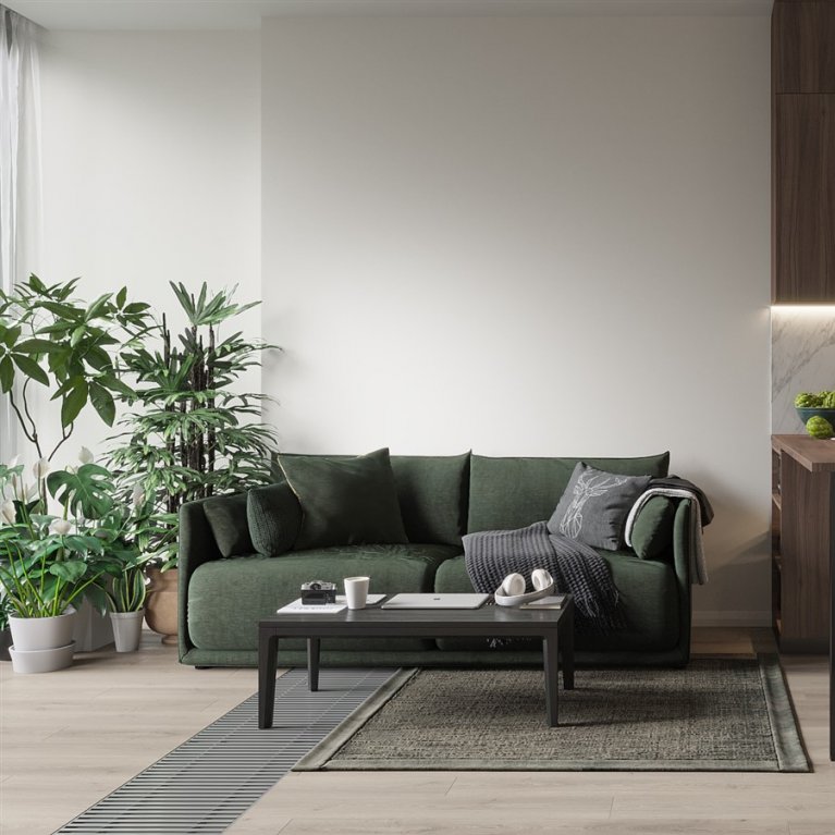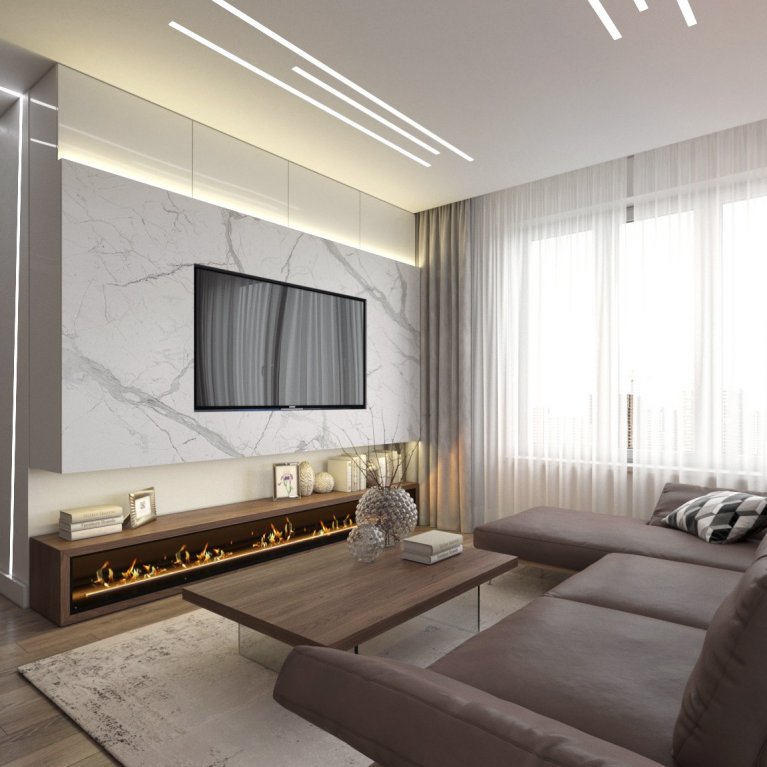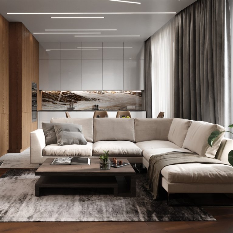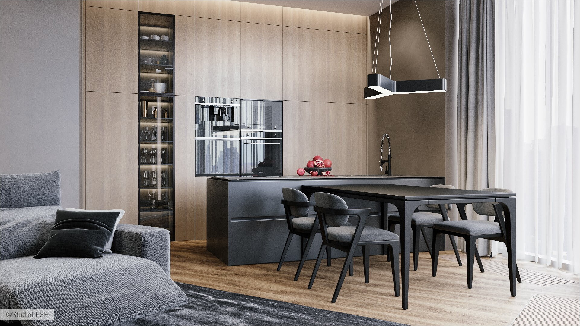
The place where you want to stay - this is how you want to call the apartment's interior with an average area around 100 sq. m. with a corner layout and three panoramic windows. Such a metamorphosis is a result of the designer's diligence. The project itself is hidden from the sight, but its significance is understandable while walking inside the space.
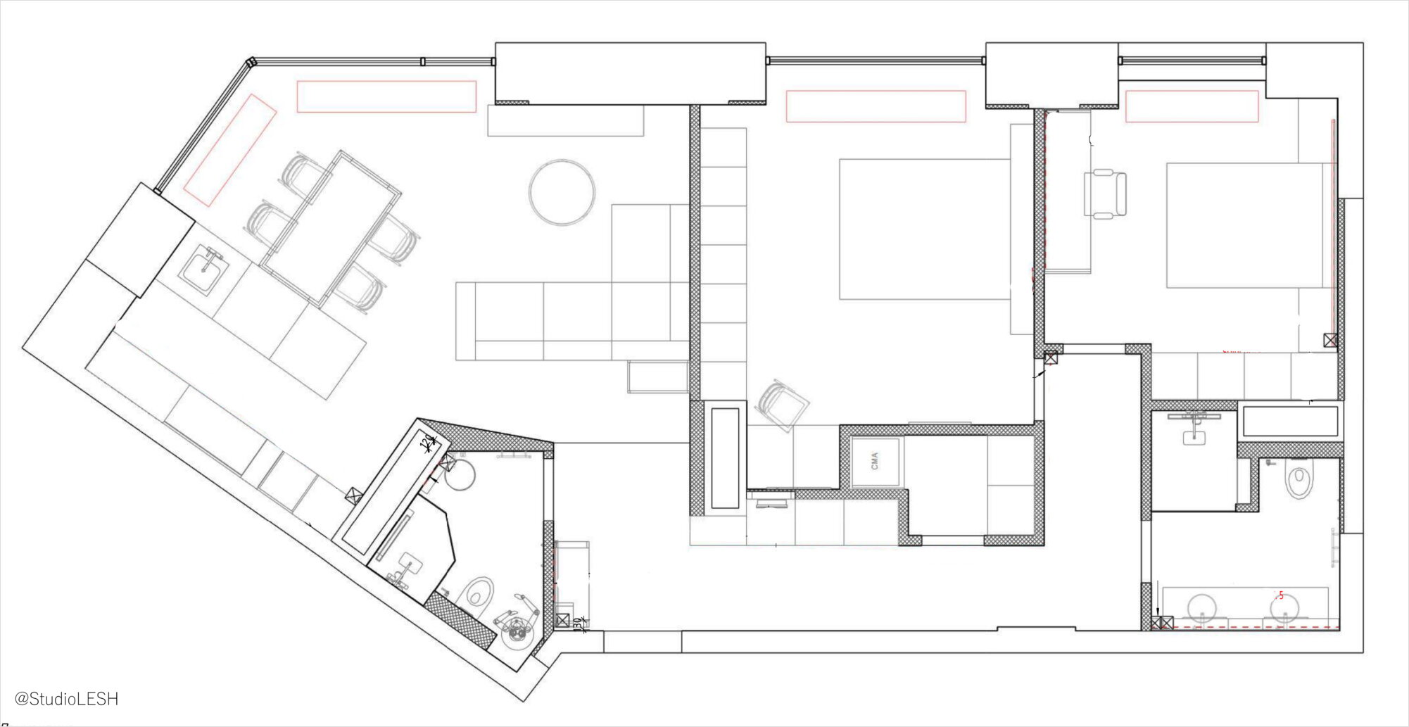
The layout was carried out according to the customer requirements. Free planning solutions of the apartment, the sufficient quantity of riser connections and ventilation shafts enabled organizing of two bedrooms, a kitchen, a living room, two bathrooms (one for the guests, the other one for the owners). Concealed doors are the leitmotif of the interior. Decorative plaster on the walls simulates the concrete texture. The same cover is used for Dolce Porte doors.
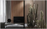
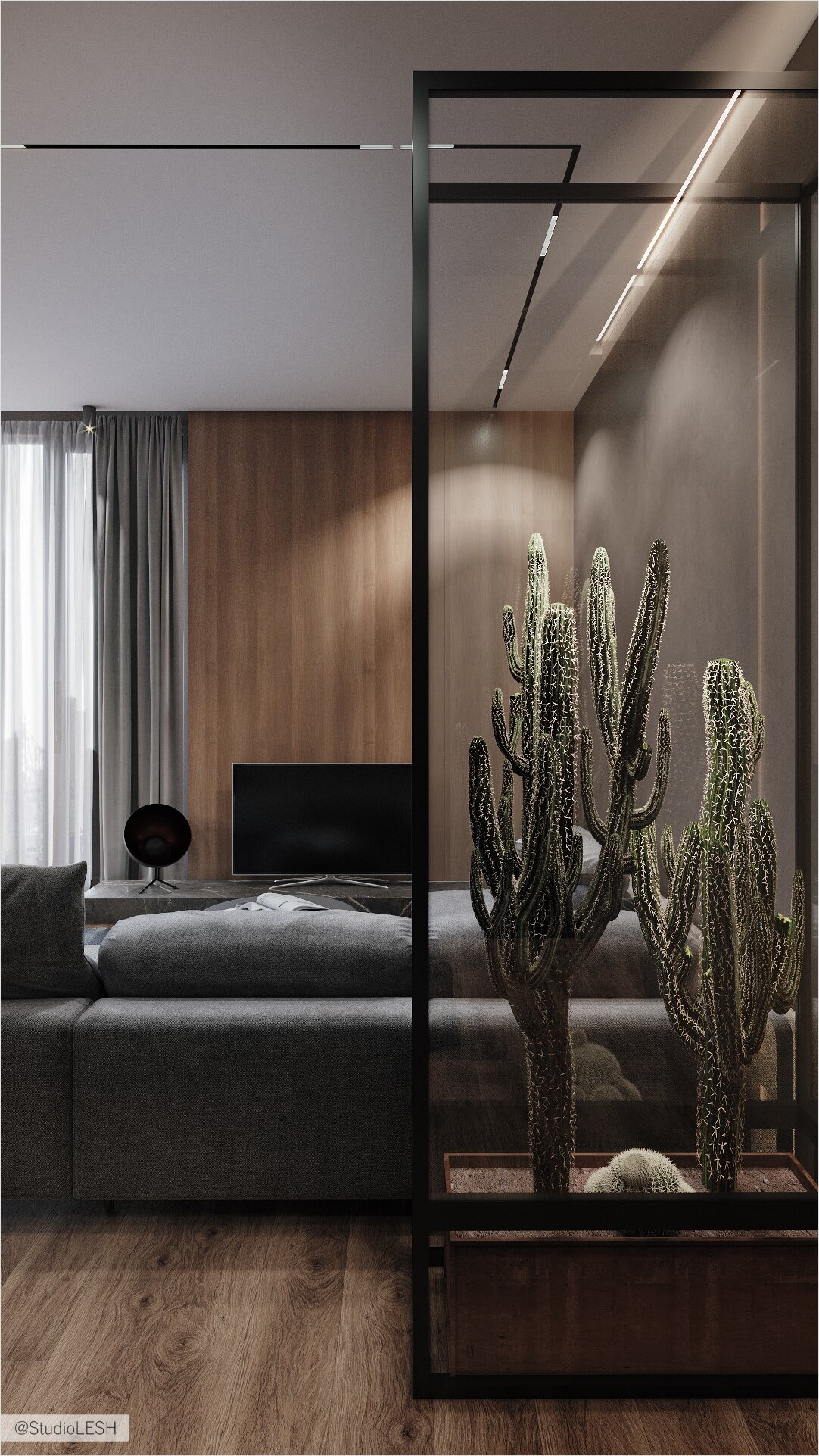
Of course, the most striking accent of the space is the "terrarium" for the cactus – metal&glass construction, which is the first to catch an eye when we enter the apartment with a strange plant inside. It serves not only as a decorative and functional partition, but also it's a central topic of conversations, and ideas generator for both hosts and guests. This is a great example of how the design detail can turn a simple feature into a memorable one, and it's cool.
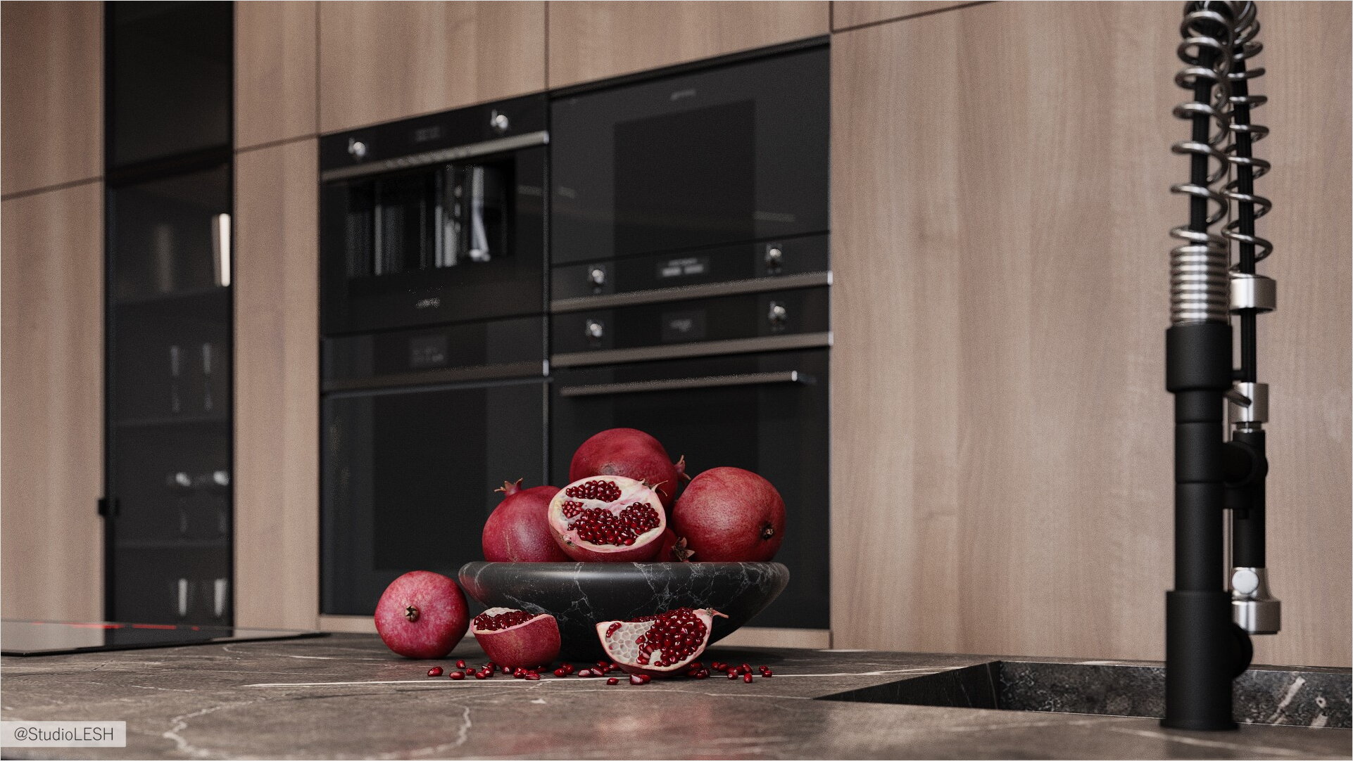
The non-standard kitchen equipment is also worth paying attention to. Here it was used as a functional island with a sink, dishwasher, stove, and hood; this moment requires a pre-thought out engineering solution and correct network wiring. At the same time, according to the design in the combined kitchen-living room, the kitchen equipment perfectly integrated into the furniture ensemble, that is, the equipment removal to the island enabled creating the rear cabinet structure to the entire room height, which significantly changed the kitchen interior and layout. It's also worth noting that there was used the Elica Pandora concealed built-in hood, which perfectly fit into the entire solution, and the island looks just like a monolithic granite bar.
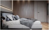
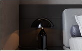
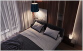
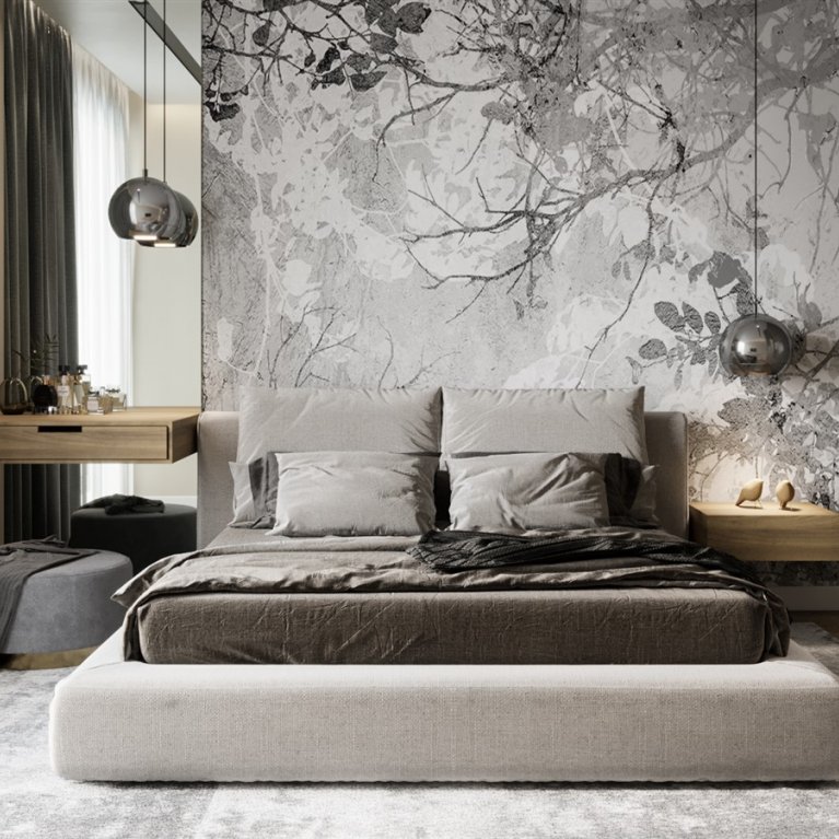
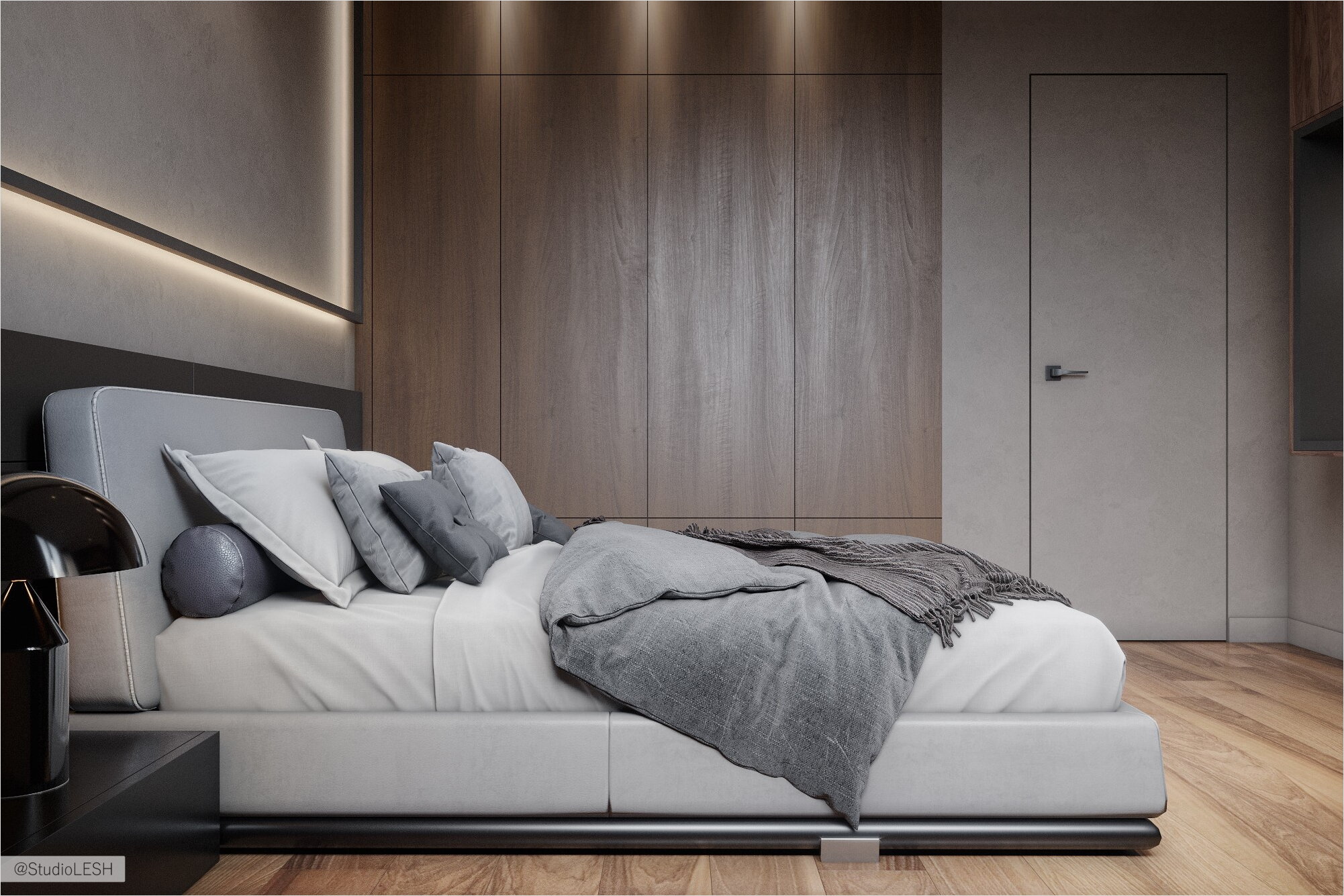
Two bedrooms have the same functional set, but each one is interesting in its way. In one, the bed heading is made of wooden panels where the lighting is integrated, which sets the asymmetry, quite elegantly balancing with the bright suspension made of RENATA 32 glass. In another bedroom, a simple and laconic geometric lamp made of black iron deserves attention – it provides volume, while clearly defining the room axis. This lamp was made to special order and met the expectations of both designers and owners. In each of the bedrooms, there is the work desk and boudoir table. Both solutions are quite laconic, but each one creates a different atmosphere. The working table in the larger bedroom is combined with a TV zone, which turned out quite organically and doesn't cause the conflict of functions.

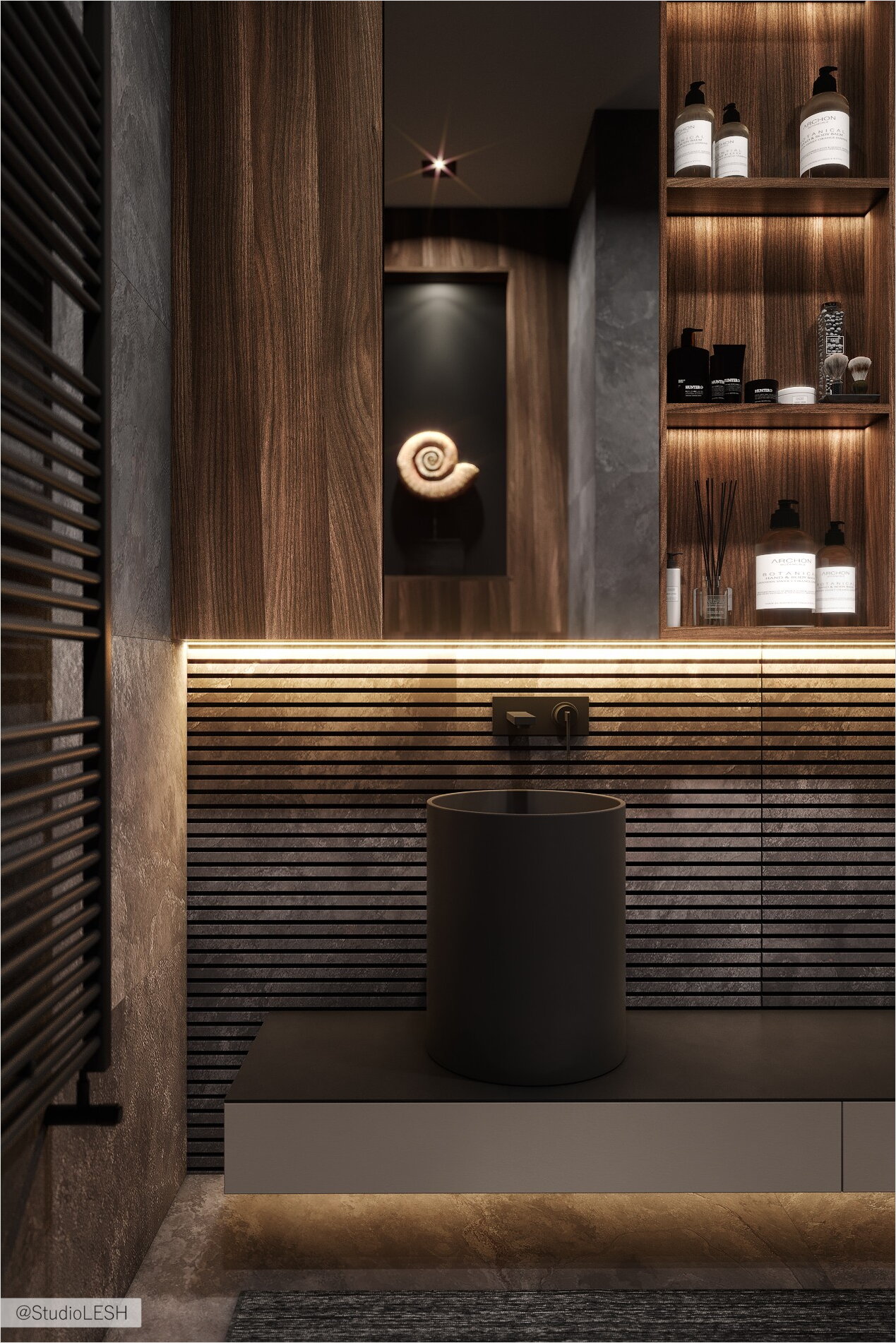
Both bathrooms have a minimalistic design but are not boring at all. Of course, sanitary ware, such as sinks "Galassia core", "Montebianco Migliore Pisa", creates a special style in the space, but the skillful designer's work can be noticed not only in the selection of sanitary ware but also in the correct and ergonomic arrangement of all equipment, the use of finishing materials and lighting, which is fully presented in these sanitary facilities.
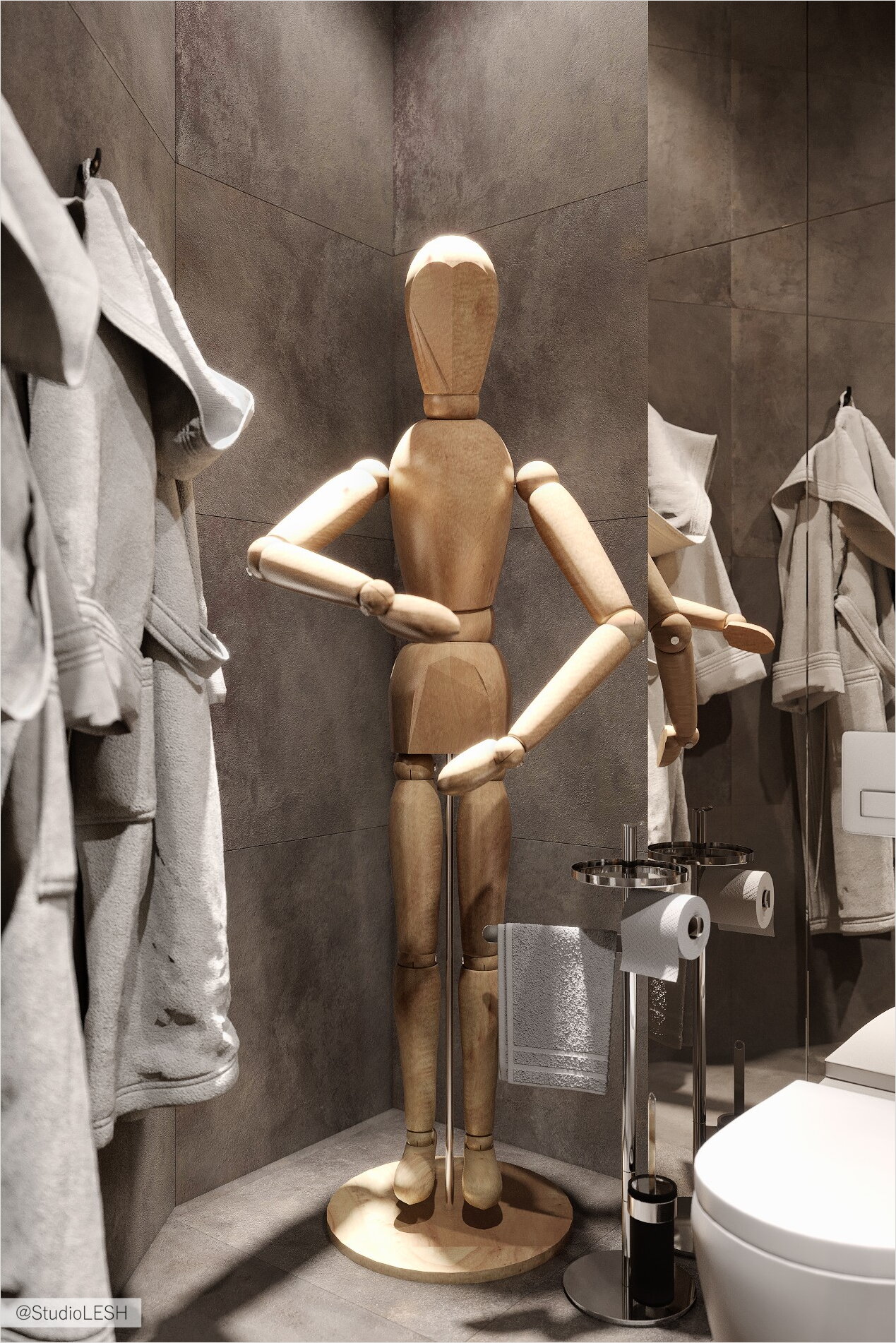
In the guest bathroom, there is a playful reference to the childhood – a sculpture of a wooden man from IKEA, but a gigantic scale. The play of scales and the search of associations make it possible to bring the observer back to his childhood, awaken pleasant memories. It's cute and uplifting. But, the design itself is to set the mood, and the interior of this apartment is great proof of this.
