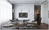
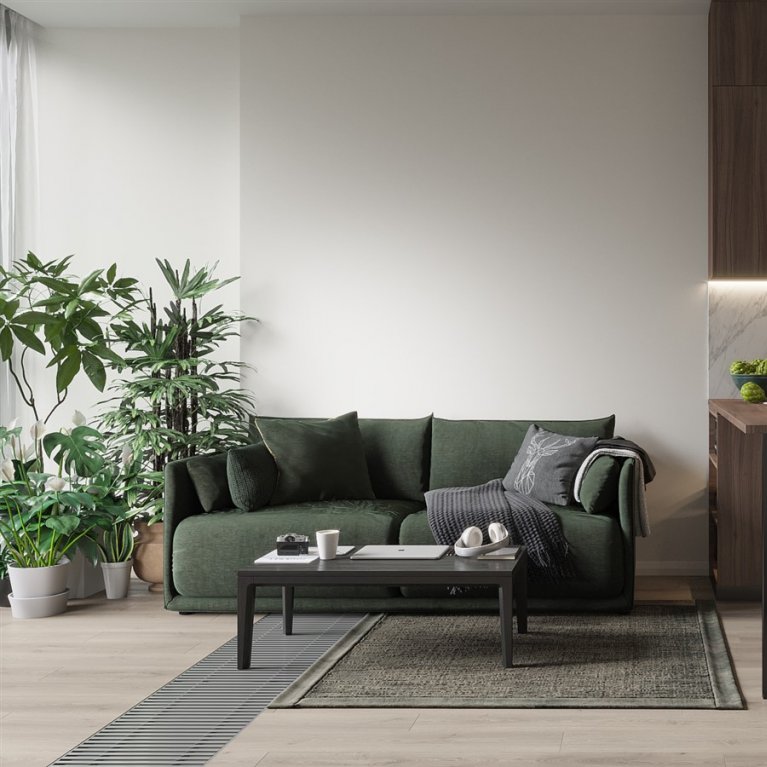
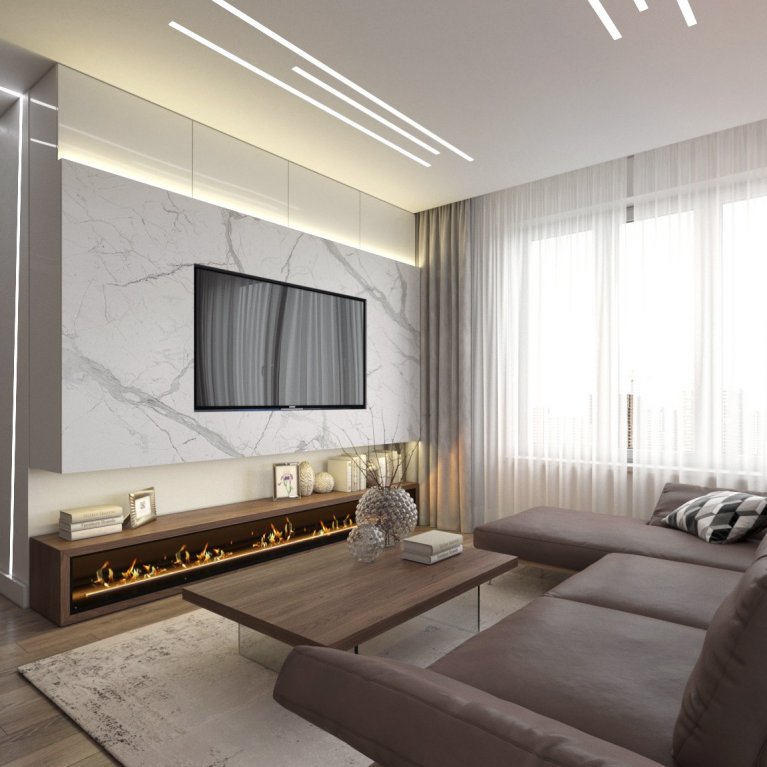
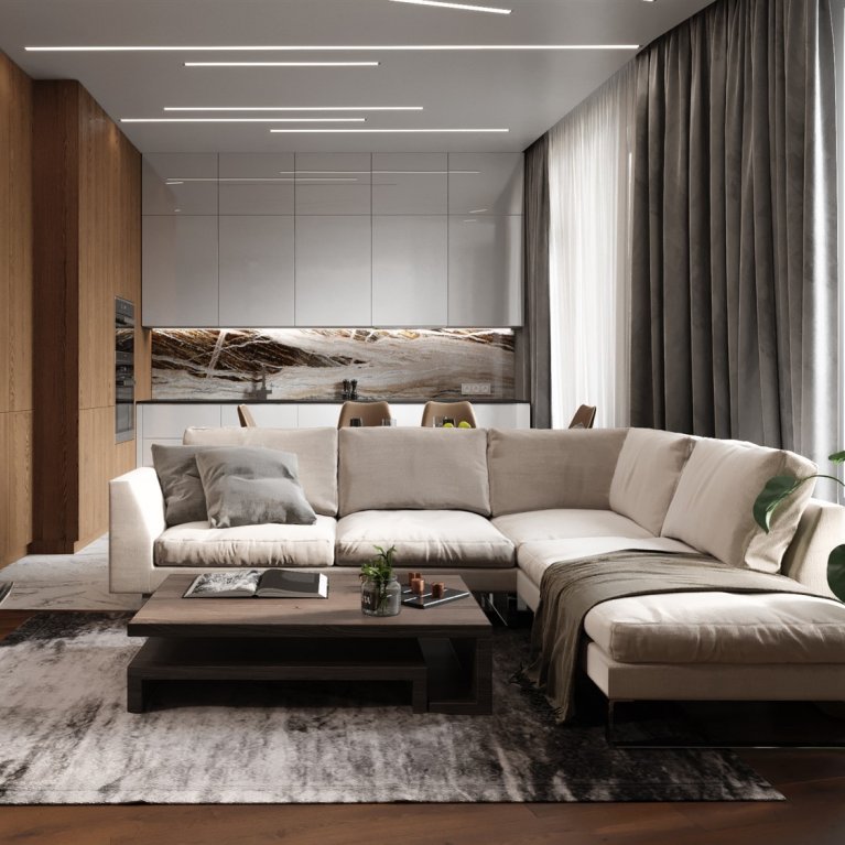
The main task in designing of this apartment was to create the most comfortable and functional space for a family of three - parents and a child.
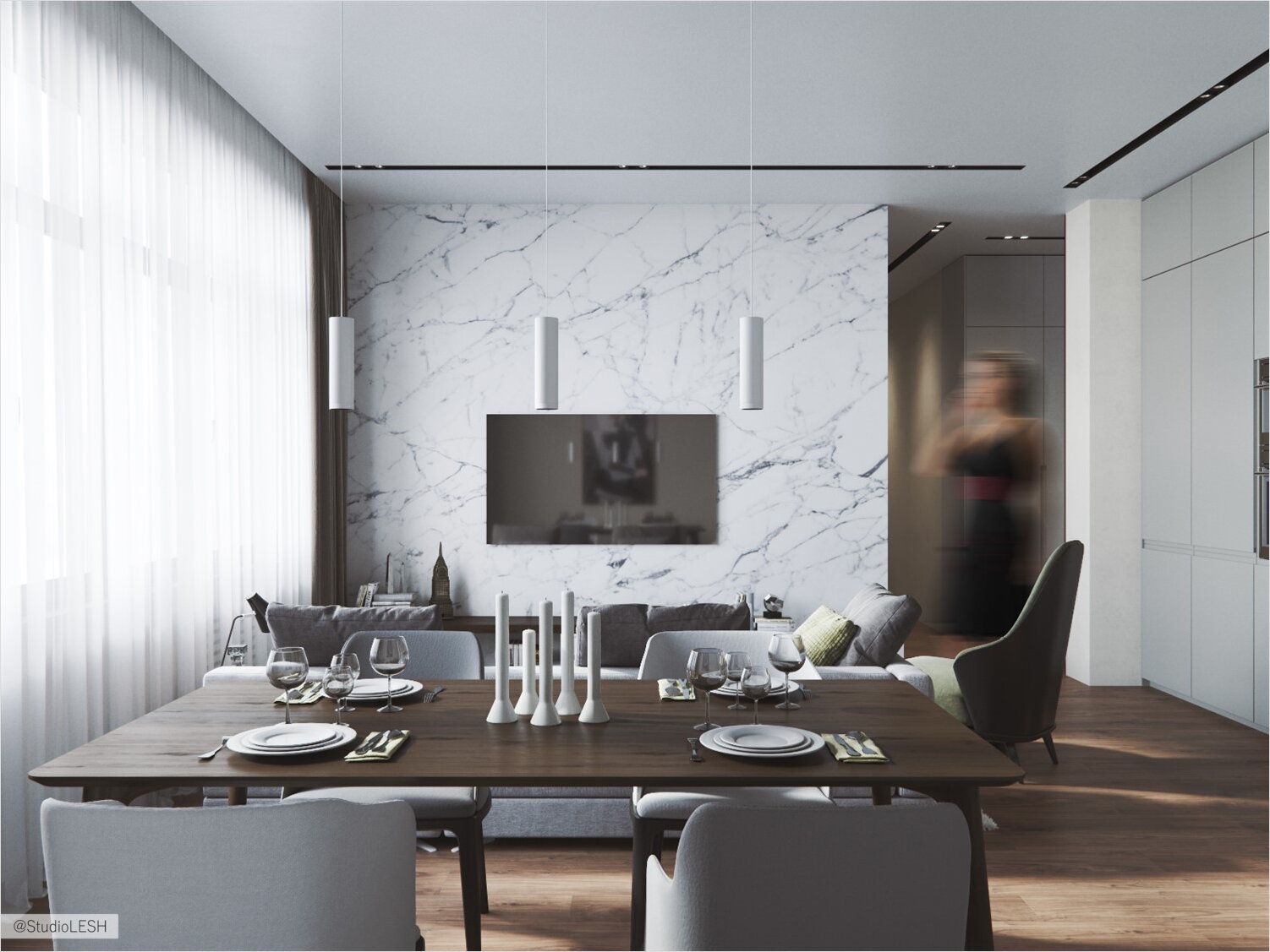
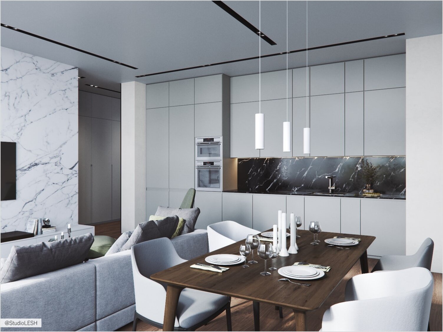
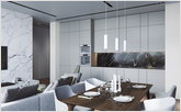
The developing of the layout did not take much time, because the main wish was to leave a large central room for the combined kitchen-living room. Here we also locate a large kitchen set where all the available household appliances could be placed. It was also necessary to create a comfortable kidroom for growth.
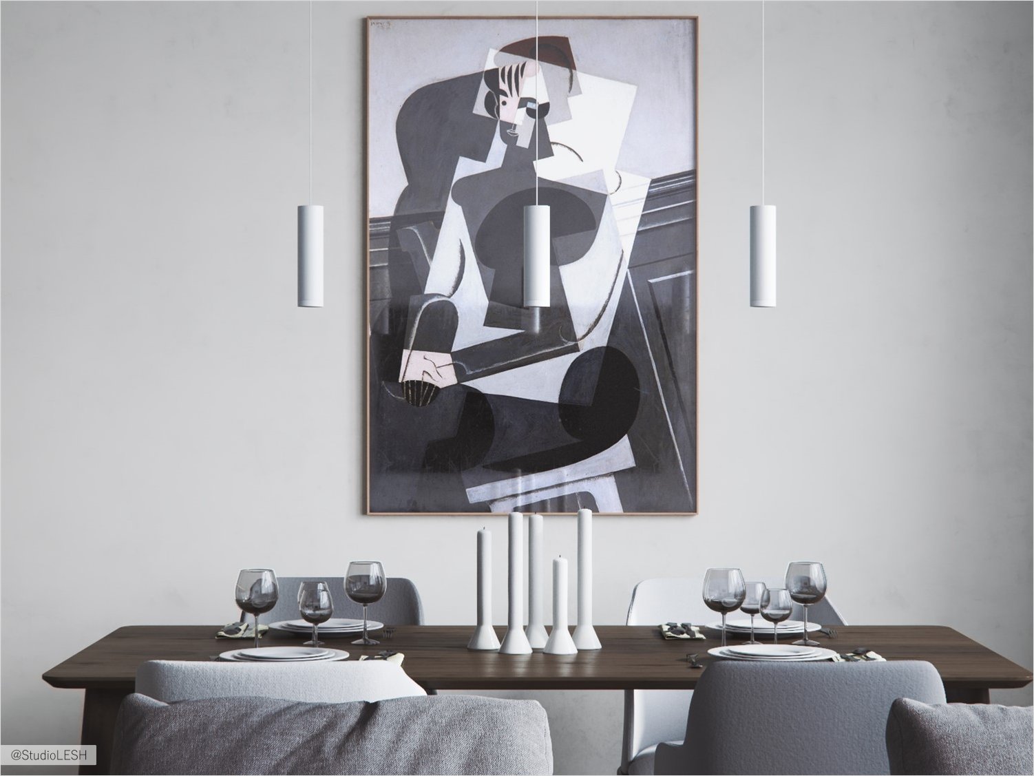
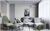
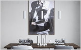
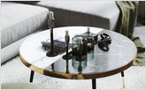
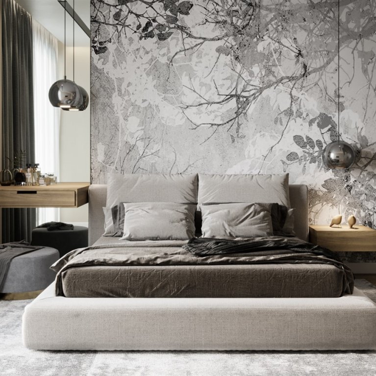
The interior of the apartment is designed in a modern style with elements of minimalism. The main task was to create a functional, convenient and comfortable space, with a large amount of light and air. The color scheme of the apartment is a color scheme based on a combination of warm and cold shades of milky-white, beige, gray colors. Various color accents are also used, mainly pistachio and blue shades, in the details of the decor - armchairs, textiles on windows, bedspreads, pillows, carpets.
- Creation of the direction with the help of main light
- How to hide the ventilation ducts in the interior
- Why there is a need to sew up space with kitchen set
- Is it possible to make a shower room instead of a dressing room?
- Room integrity due to storage system
Creation of the direction with the help of main light
There was various lighting scenarios are developed in this project: overhead ceiling lamps in the kidroom and in the bathrooms, accent lighting of different areas with the floor lamps, pendant lamps, table lamps.
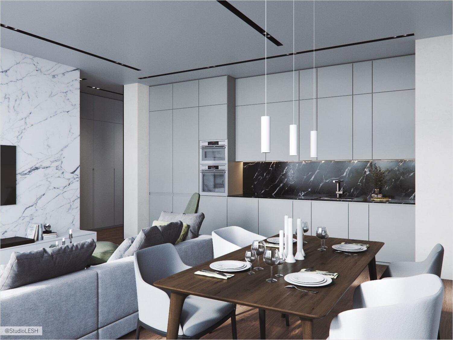
The main feature of this project became the main lighting in the largest open area of the apartment - this is a kitchen-living room and a corridor, where the track lights hidden in the ceiling niches set the direction of movement throughout the apartment.
How to hide the ventilation ducts in the interior
The apartment is located on the top floor, its feature is the presence of five ventilation ducts in the apartment. The task was to hide the columns of these ventilation ducts. 
For this, partitions were built in such a way as to hide the ventilation channels, or the furniture was placed in such a way that the ventilation channels served as a natural niche for it, for example, in the parents' bedroom and in the bathroom.
Why there is a need to sew up space with kitchen set

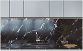
In the kitchen and living room, a non-standard decision was made regarding the closure of the ventilation duct - it was decided to place the kitchen linearly and sew up the space behind it along with the ventilation duct. On the one hand, it seems that we are losing room space, although in fact, this solution helps us to create a clean, organic and correct space, without unnecessary angles, which will be pleasing to the eye.
Is it possible to make a shower room instead of a dressing room?

One of the wishes in this project was a separate shower room in the parents' bedroom. In order to translate this desire into reality, it was necessary to specifically coordinate its placement, because in this place a dressing room is provided according to the layout of the developer. The result was a comfortable space in the bedroom for the parents with their personal shower - a piece of luxury in an ordinary city apartment.
Room integrity due to storage system
Organizing a storage area in a room requires a special approach, for example a separate closet that does not fit into the interior can become an element that violates the integrity of the space and will be noticeable with a general view of the room.
In this project, it was decided to firstly make the storage area in a separate niche, and secondly the built-in wardrobes represent a floor-to-ceiling construction. The facades are combined with color to the walls, so the room remains a holistic space with a hidden storage area.

Since one of the trends in interior design is now the so-called “nature” - proximity to nature, environmental friendliness, the decoration uses mainly natural materials or materials that imitate them by texture and color - wallpaper for painting, wood of light shades, and porcelain stoneware with marble texture , stone, natural fabrics.


