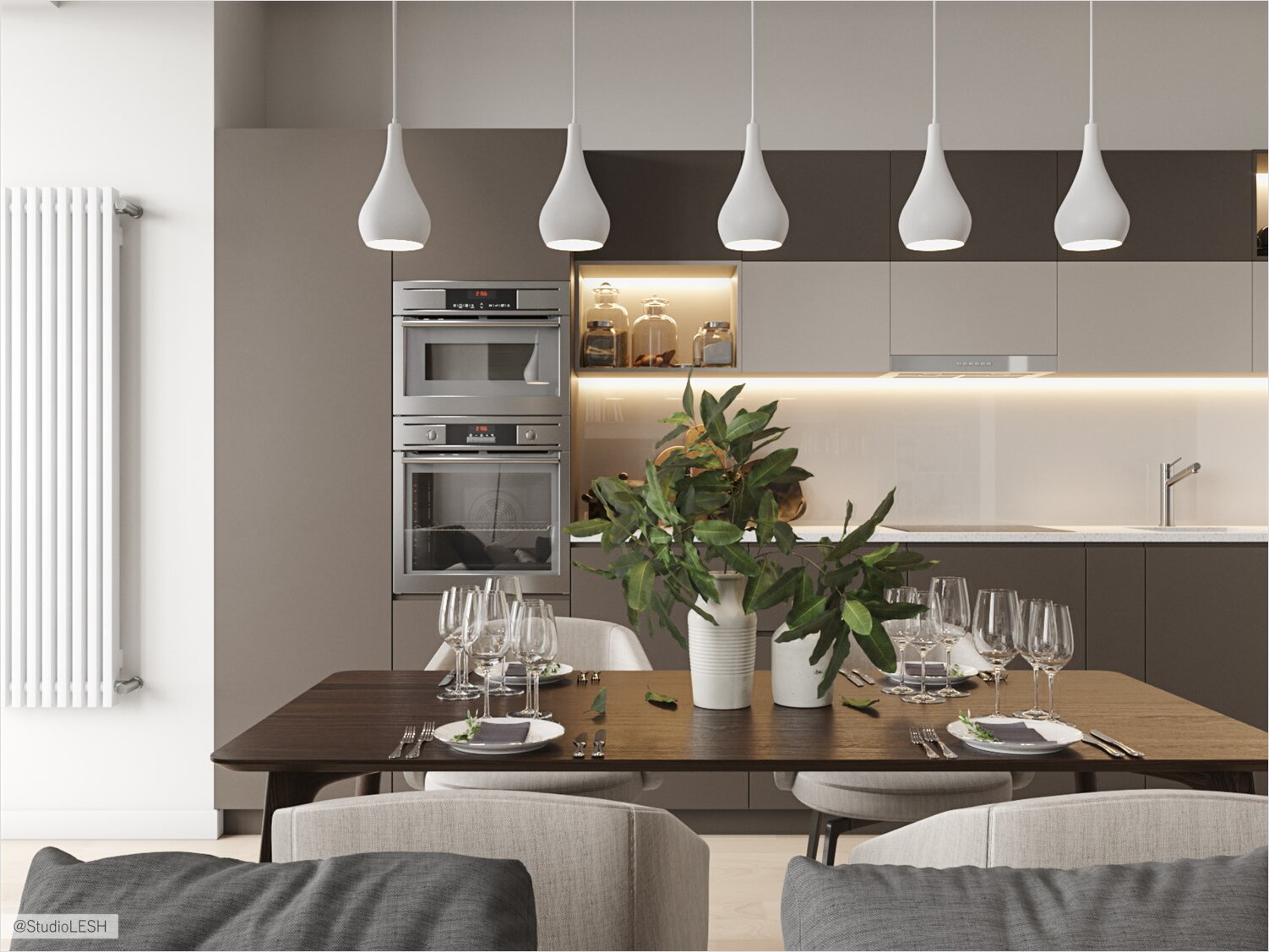
The apartment in apartment complex “Duderhoff club” became our third project at this complex. The layout and the square is the feature of these apartments, it allows the designer to make stylish and functional interior and not to limit creative thoughts. The clients are a young couple who dreams about family cosy apartments where will be an atmosphere for starting a big family and also for the relax with a big company.

- The organization of kitchen and dining room
- Shelves for cat on the structure-bearing wall
- Detail geometry
- Wooden headboard with the light in the niche
- Lighting scenarios
The organization of kitchen and dining room
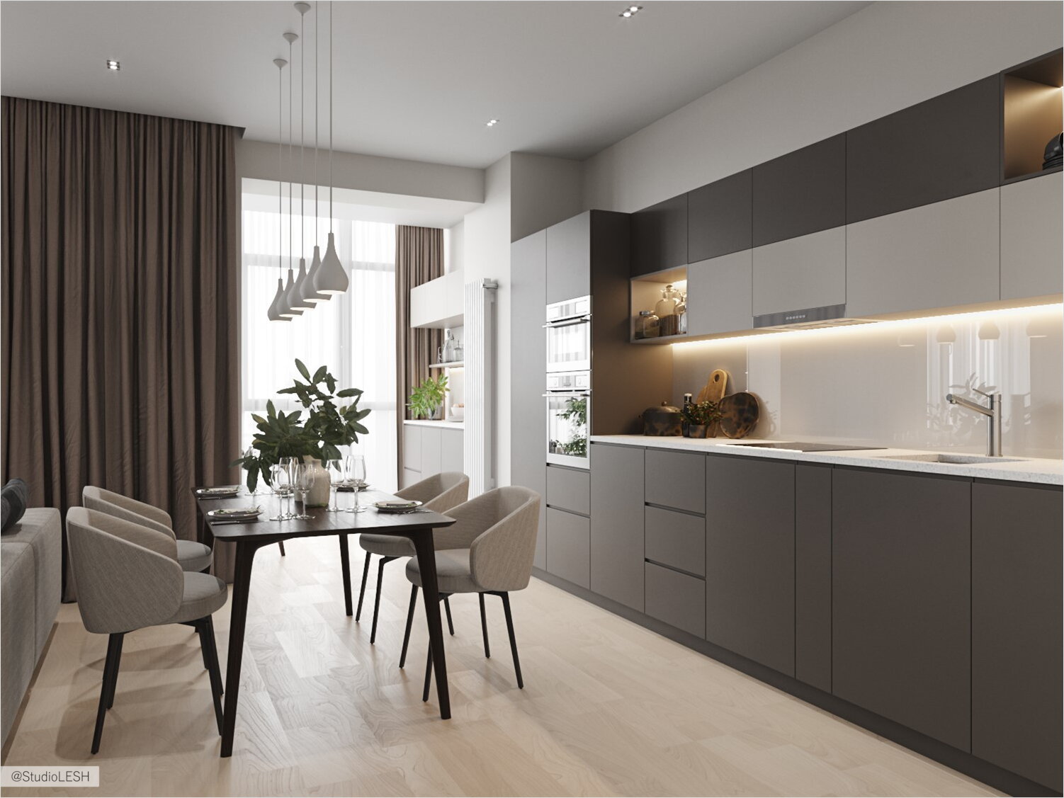
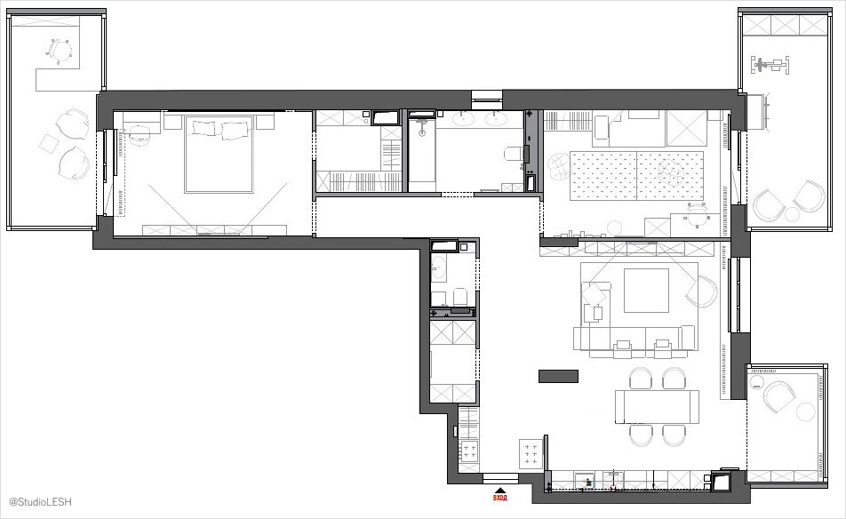
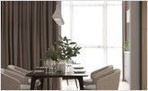
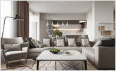
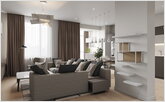
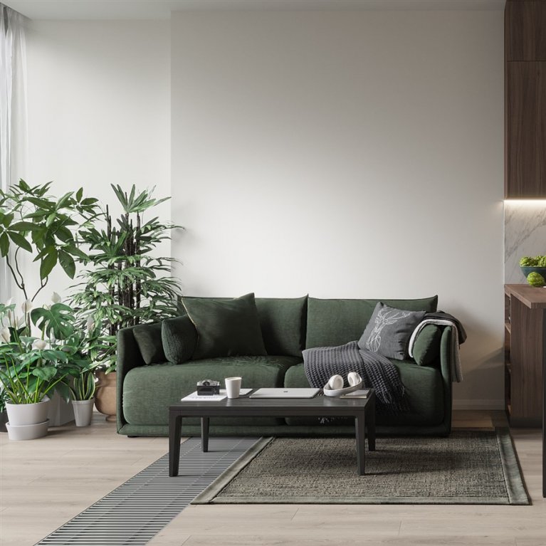
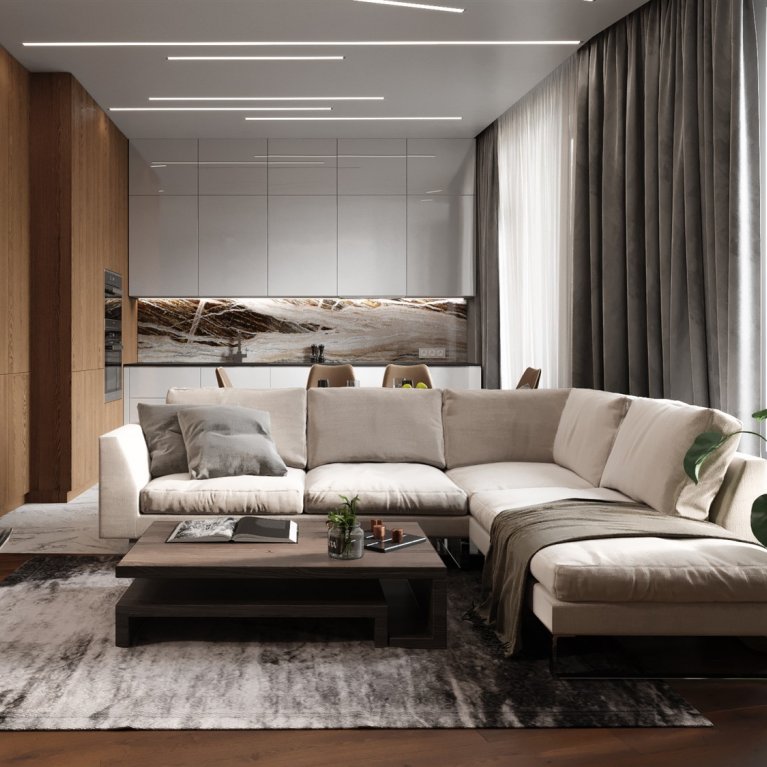
The biggest room in this apartment - it is a living room connected with the kitchen. Here we also see the whole dining group, it was made for separation the cooking zone, relax zone and dining zone. The owners can have a big company of guests because space affords to make full-size furniture groups.
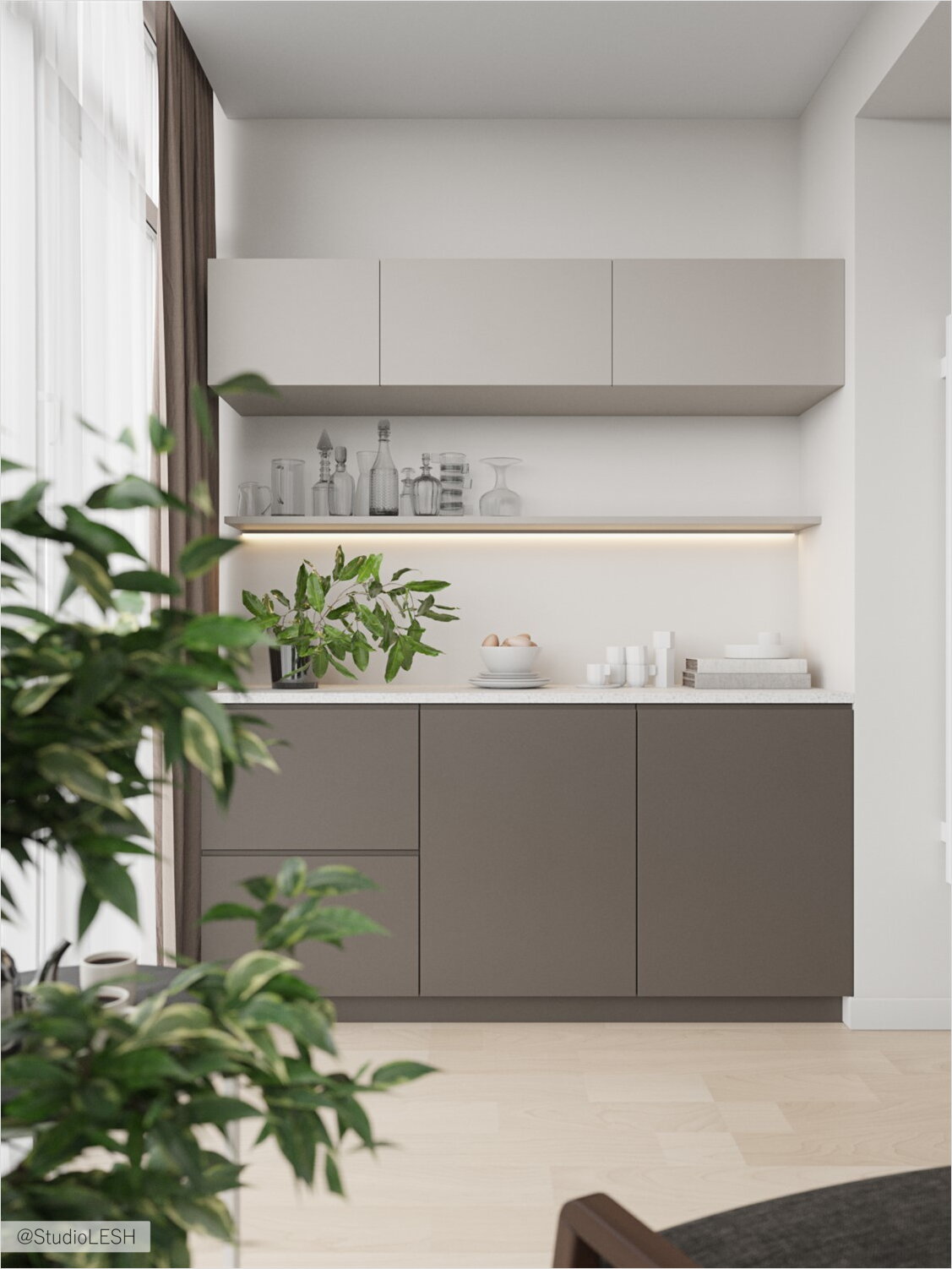
Here was a balcony which we decided to connect with kitchen for the increasing of the space and make more natural light in the room.
Just remove the wall which connects the balcony and the room was impossible because it is structure-bearing. That is why we have a challenge about organizing the balcony space in such a way that it had become a part of the room but we do not need to remove this wall.
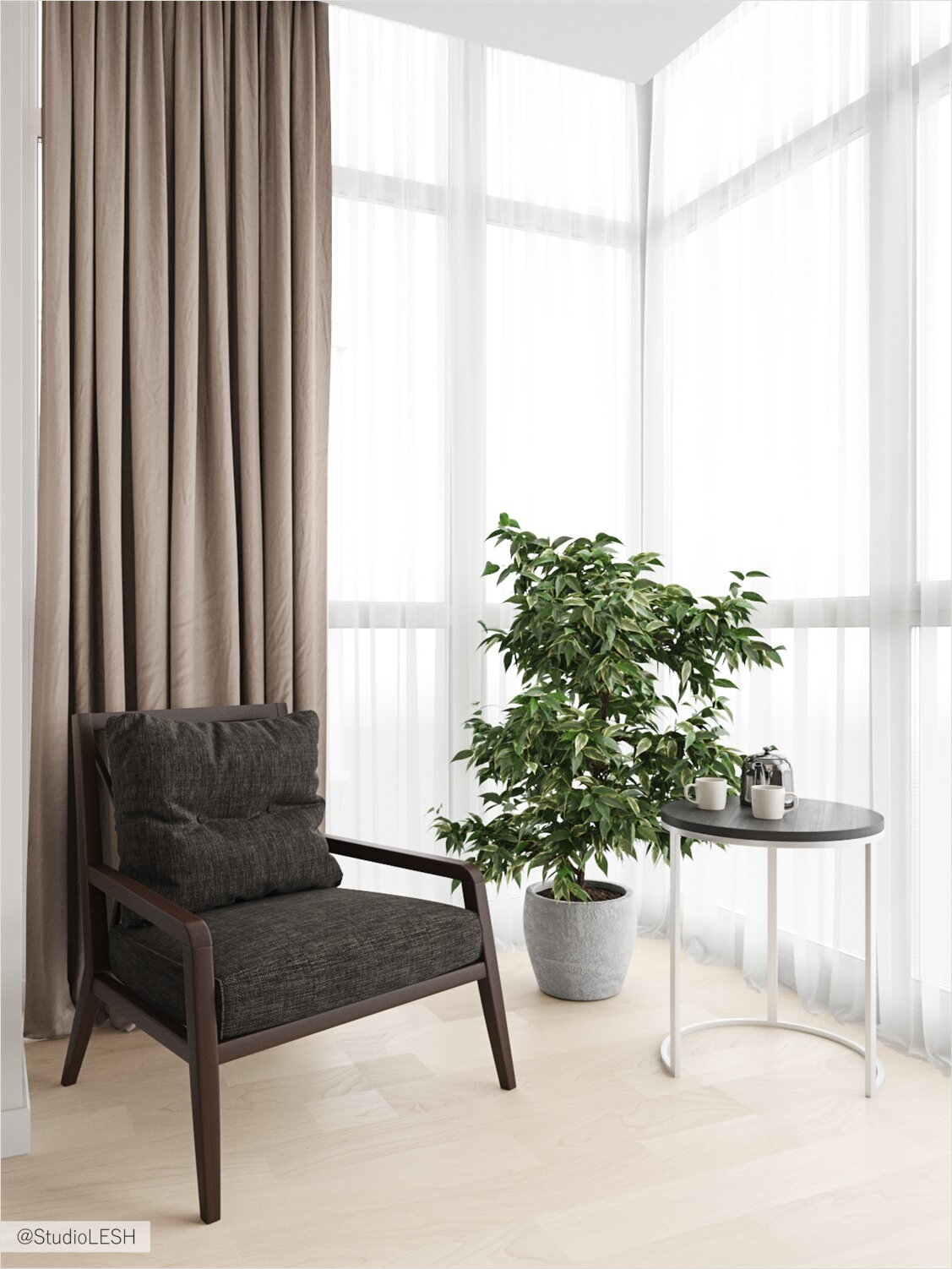
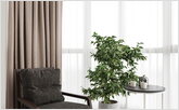
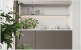
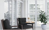
The decision was next: here we continue the kitchen and place the lockers for extra tableware and wine, on the other side it was placed a relax zone with chair and coffee table.
Shelves for the cat on the structure-bearing wall
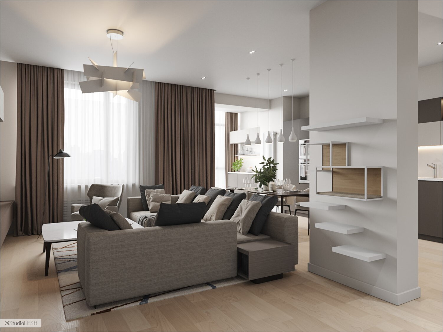
We need to remove all partitions for creating an open space in the living room and connect it with kitchen but there was a structure-bearing construction which we need to leave.
The clients have an animal - the cat, that is why we decided to make a space for it. Here we place geometrical shelves with space for secure manoeuvre.
Detail geometry

The minimalist style implies minimal count of the details in the interior, but for bringing the punch line to minimalistic style the designer decides to build the concept around the geometric forms and emphasises.
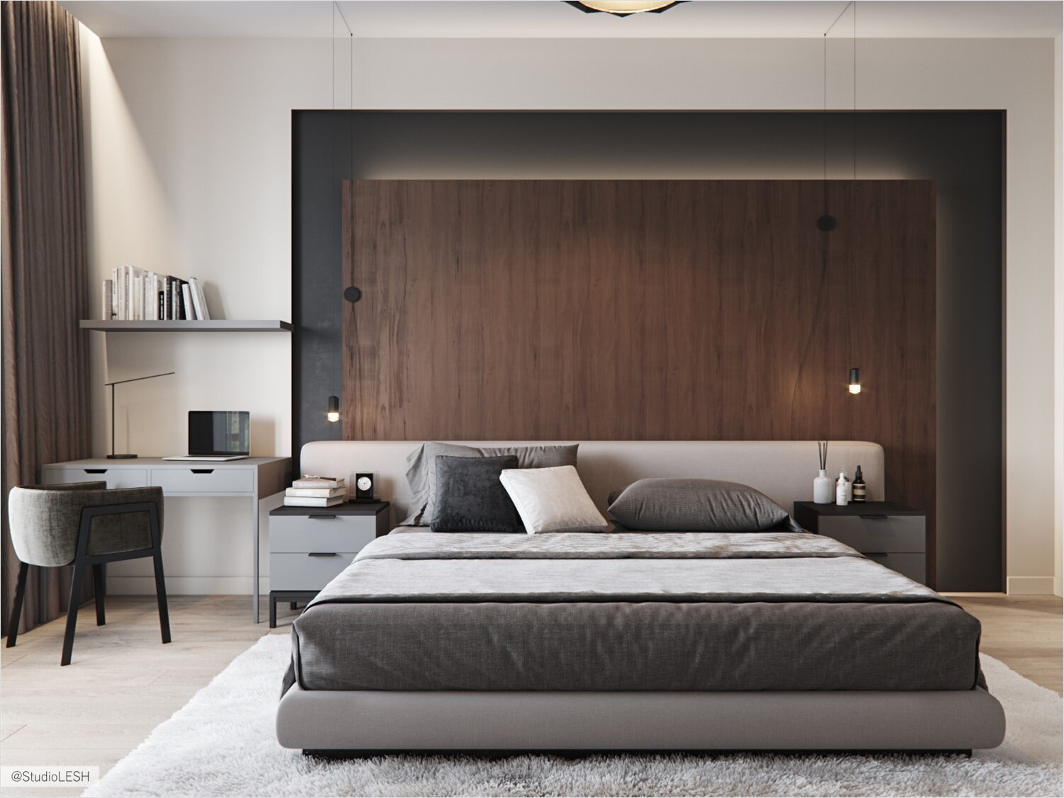
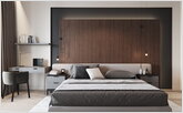
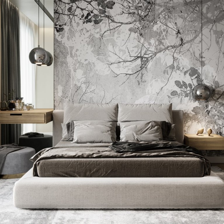
The spirit of geometrical forms present in details from the picture on the carpet to the chairs in the bedroom. Selection of the light was made also under this concept. The geometry has not been spared the bedroom, where the headboard is a set of rectangular forms they stand one after another and make a finished piece.
Wooden headboard with the light in the niche

The visual emphasis in the bedroom here is the construction which allocates the dream zone. The niche was painted in warm black colour, that gives the bedroom depth and emphasise the atmosphere of dream peace and universe pacification.
There is a wooden panel in the niche, it has a distance with a wall for installation of light behind. Such construction underlines the concept of the apartment with geometrical emphasis and became tasteful and functional elements of the bedroom. You can make a cosy evening effect not turning on the whole light in the room.
Lighting scenarios
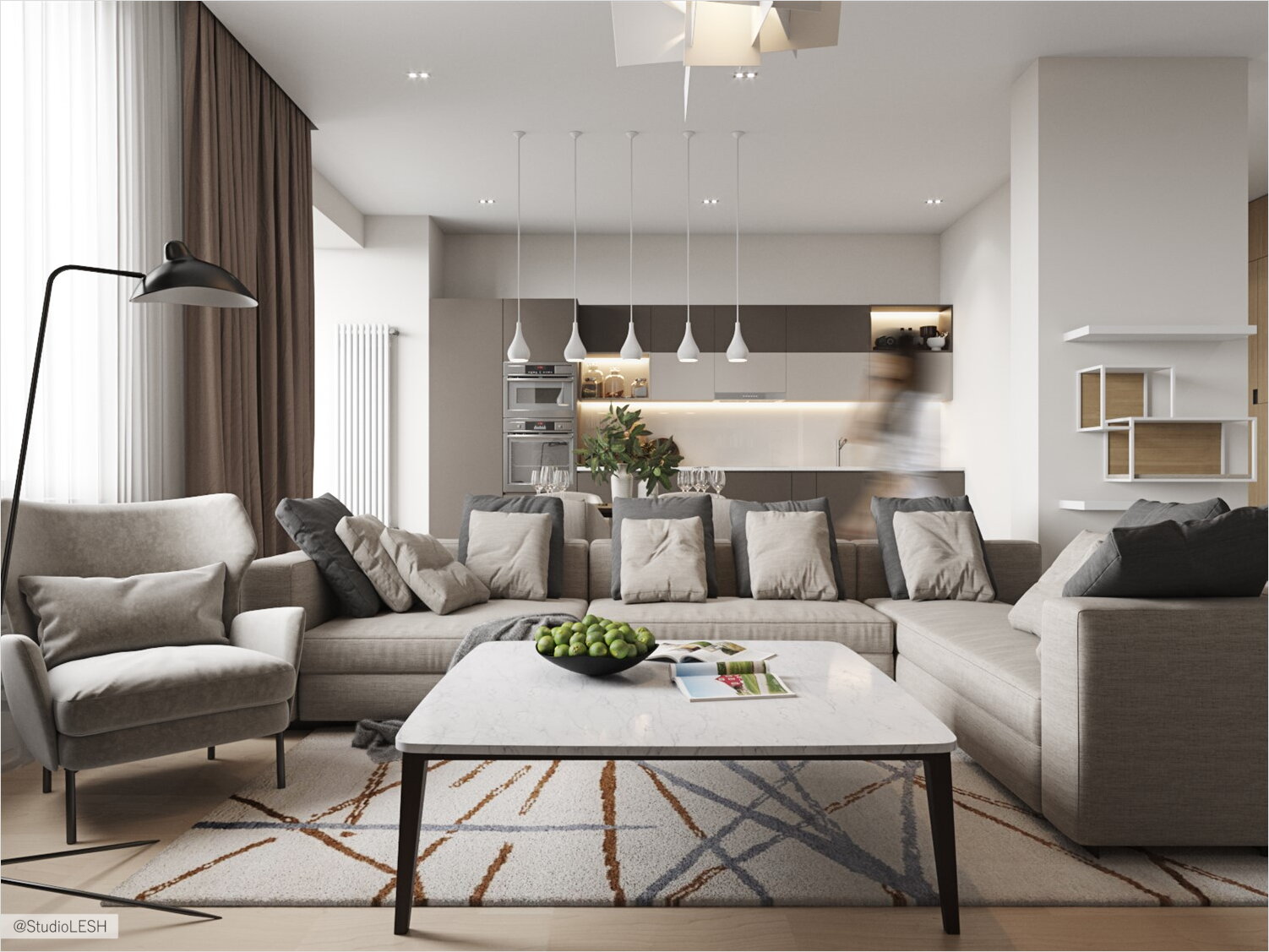
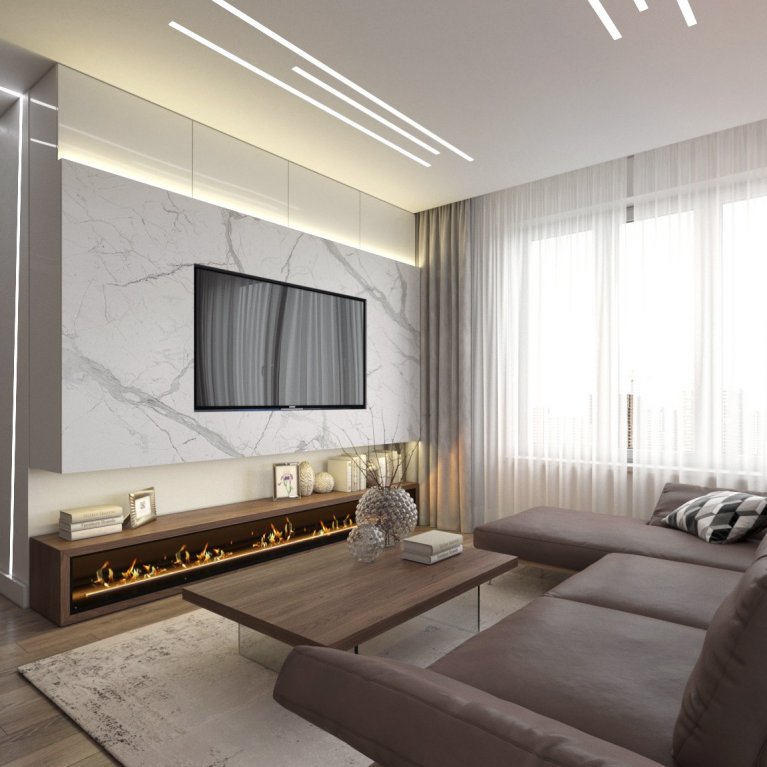
The apartment has unified lighting in the form of built-in lights, which gives bright lighting for all rooms. At the same time, there are various light scenarios of local luminaires which allows you to select zones that you use at a certain moment.
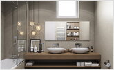
Separate lighting is provided here over the dining group, above the coffee table in the living room, in the seating areas, in the work area and in the bathroom next to the mirror. Such a solution allows you to create a cosy atmosphere in the room or a sense of privacy in recreation areas.
