Most likely you often ask yourself approximately a question like this, why do some designers just make mind-blowing interiors that get into all the media that then try to copy and reproduce, while other designers create something mediocre and depressing?
The thing is that professional designers use six basic principles in their interiors: proportion, harmony, balance, rhythm, accent, and contrast. In this video, I will tell you about these six main techniques used by professional interior designers and try to explain how they work with examples.
Hello, dear friends, I am glad to see our old subscribers, and for those who are with us for the first time, my name is Alexey, I am the art director of the «LESH» design studio and a practicing designer. And don't forget to subscribe and turn on notifications so that you don't miss any new useful videos. And also subscribe to my Instagram, where I post my work, which can serve as a great source of inspiration for you.
A good interior has nothing to do with a piling up of beautiful pieces of furniture and expensive finishing materials. To a greater extent, this is the interaction of the geometry of the room, shapes, textures of the furniture, color, and light. And if you know on what principles all this interacts with each other, then you can squeeze the maximum out of any room and turn it into a truly fabulous interior. And by the way, if you want to see with your own eyes, touch with your hands unique designer furniture, interior items, I invite you to the «LEITMOTIV» salon on Barochnoy 12
The Accent
The accent in the interior is necessary in order to arouse interest and consolidate the visual impression of the interior. It is also called the visual center or focus. This is what our attention is focused on, what makes the entire interior unique and memorable. It should be something interesting, unusual, textured, and visually attracting our attention.
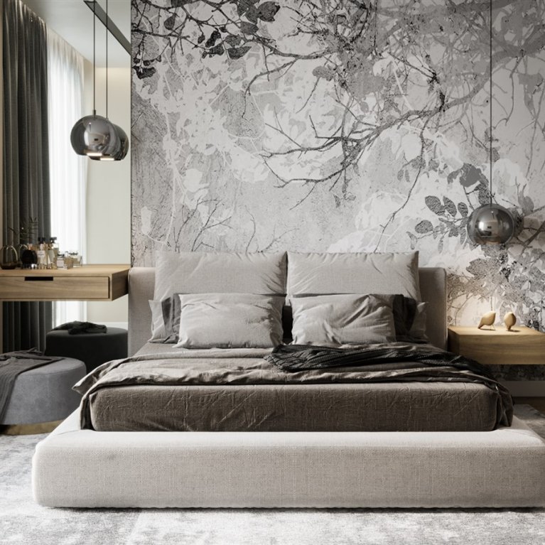
Some specific object that catches your eye as soon as we are in the room. It can be a huge colorful picture in the center of the wall above the bed, sofa, or by itself, as on this wall in the hall.
Also, at all it is not necessary that the accent is on the wall, it can be a coffee table with an interesting shape or with a rich texture, or for example, large unusual chandeliers above the table. In general, everything that somehow makes us pay attention to ourselves, attracting our gaze.
A room where everything has the same meaning will seem boring, you can perfectly choose the finishing materials, colors, and textures, but the interior will be...none at all. So you need an accent, a focus, to break the monotony of the space.
The most difficult thing with accents in the interior — is not to overdo it, follow the golden rule, better less, yes better.
The Contrast
In interior design, it is very important to contrast different objects with each other. They can be contrasted in shape, texture, color, material, or scale. This can be achieved by combining smooth and rough surfaces, light and dark materials, something calm and dynamic. When you apply this method to the space of your room, you fill it with life and character.
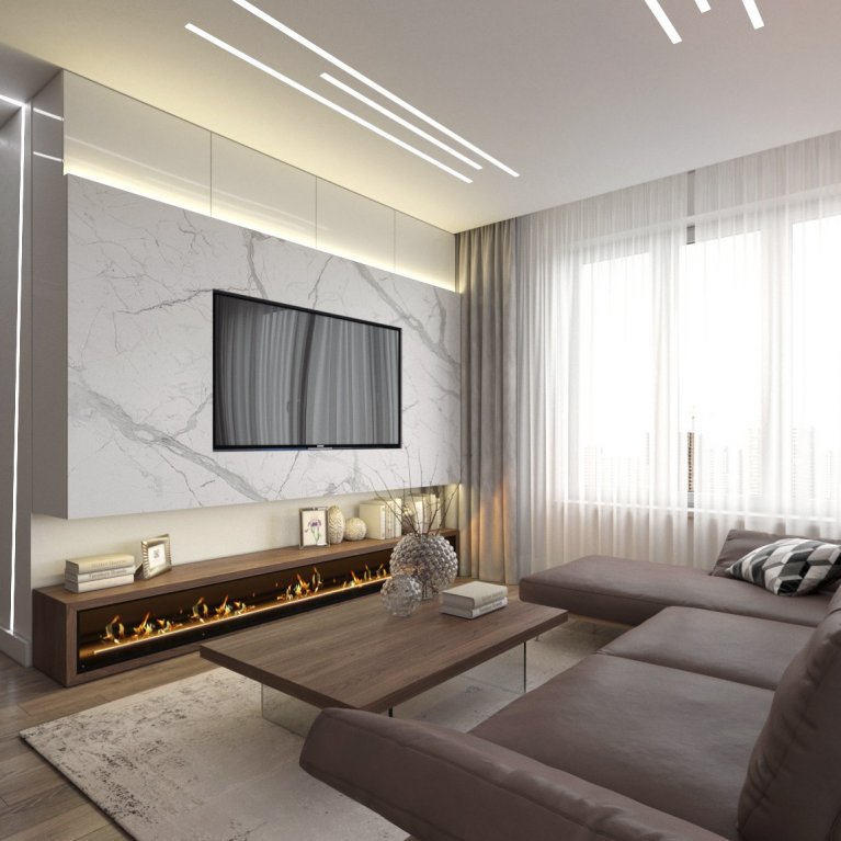
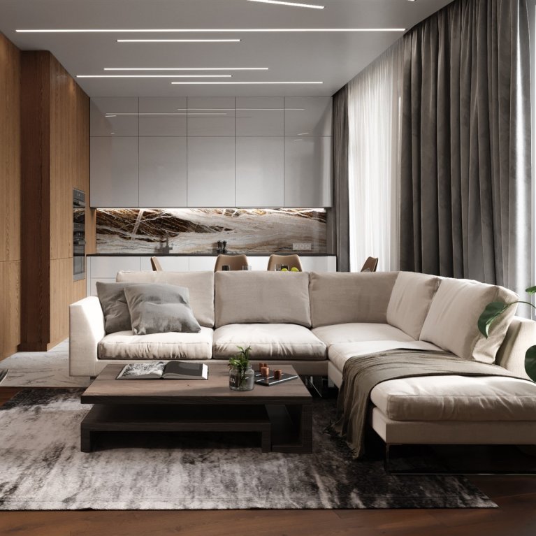
Thanks to the contrast, you can achieve balance. For example, in this kitchen, the contrast is created by such a light and almost intangible material as glass and wood, the texture of which, on the contrary, gives us a sense of stability. In this photo, the contrast is based on the use of very soft and cozy curtain material and smooth, almost sterile furniture surfaces.
The more pronounced the contrast, the more interesting and lively the interior will be, so do not be afraid, experiment, look for dynamics in the contrast, it will enliven your space and make it interact with you.
The Rhythm
In the same way, as in music, there is a rhythm in design, and if in music the rhythm is created by similar combinations of sound and silence, then in an interior design the rhythm is created by repeated elements. What makes our eyes move in space. Rhythm is based on the similarity or duplication of elements such as color, shape, or pattern. This allows you to combine the space, tie up the different materials or furniture into a single concept, make them belong to something unified, that is, make them the notes of one song.
You can create a rhythm using the same color on different objects, or it can be repeated vertical lines like in this photo. Or using the same wood in different pieces of furniture, like in this picture.
But do not forget about the intervals between such elements, otherwise, you will not create a rhythm, but a piling up in a pile of the same thing and just ruin the entire interior.
The Balance
The balance — is the distribution of visual weight or the creation of balance in the interior. For example, balance can be achieved through symmetry, where one part of the interior reflects another, this technique is most common in traditional interior styles.
In modern but, on the contrary, the balance is achieved through asymmetry. That is, we balance shapes, colors, volumes, and textures not by duplicating them, but by properly interacting with each other.
Using the right rhythm and accents, you can achieve the right balance in the interior. In fact, balance — is the balancing of some elements by others. For example, a large by volume room can be balanced by a bright piece of furniture.
The Scale and Proportions
The scale — is how the dimensions of objects relate to the size of space, proportions — are the ratios between two objects. In interior design, it is very important to feel these two concepts subtly. On the one hand, space, where objects of the same scale are used, can and will be built correctly, but on the other hand — it will be completely flat and expressionless.
For example, if you have a large room, then the objects in it should be large ones and expressive, have more visual weight, if you have a small room, use one or two large objects, so you will make the room seem a little larger than it really is.
In order to make it easier for you to work with proportions and scale, use the golden ratio, which is a proportional division of a segment into two unequal parts, in which the smaller segment refers to the larger one as the larger one relates to everything. Simply put, this is the ratio of one size to another with a coefficient of 1.62.
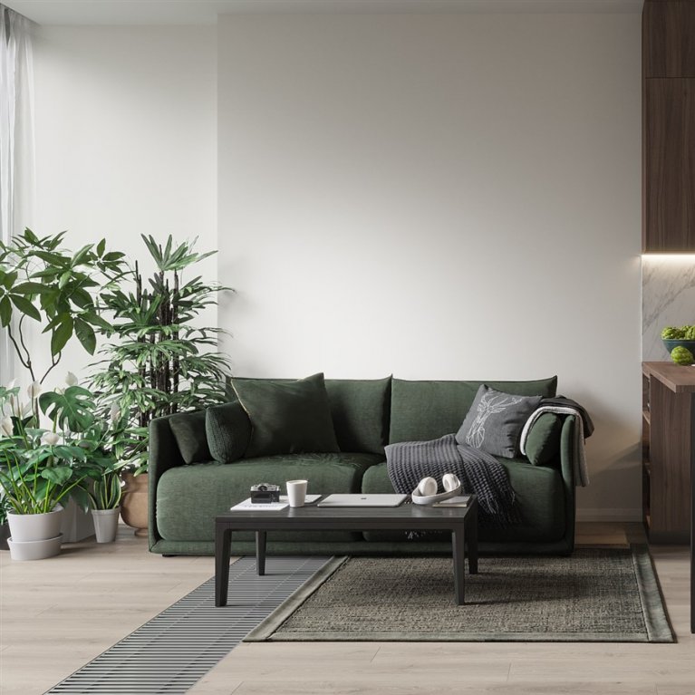
For example, the size of this sofa is about 1.8 meters, to choose tables that will be harmoniously combined with it in scale and proportion, you need to divide 1.8 by 1.62, we get 1.1 meters, that is, we need a table with a diameter of 1.1 meters. Of course, all this is approximately and no one forces you to go shopping with a calculator and a ruler and buy only what fits into these calculations up to hundredths of units.
The Harmony
Harmony in interior design is created when all the design elements are put together in one picture as if they interact with each other and create a single concept and composition. A harmonious combination can be built on a single aesthetic style and mood. As a result, it should create the feeling that each individual item is somehow connected to all the others, even if it is no longer similar to anything in this interior.
For example, if you are making a small bathroom in a modern house, then it is very strange to choose Imperador marble or Onyx tiles for wall decoration since this material is more suitable for traditional styles with large spaces and luxurious finishes. It is more optimal to choose tiles for plaster, concrete, or such stone as sandstone or slate.
All these principles are combined into an impressive interior design, these principles are the key elements of any art, whether it is painting, music, sculpture, photography, or architecture.
And if you suddenly find yourself somewhere where you do not want to leave, where you are comfortable and cozy, then know that in this place someone has skillfully applied each of these principles, and created a unique interior for you.
If you liked the video, don't forget to like it and be sure to subscribe if you still haven't done so, thank you all and see you next week.
