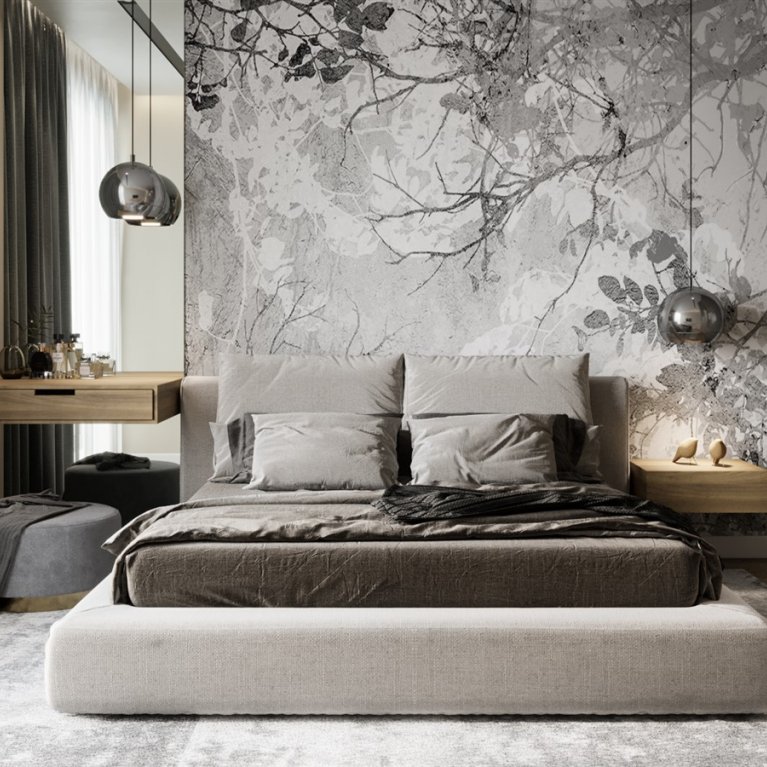
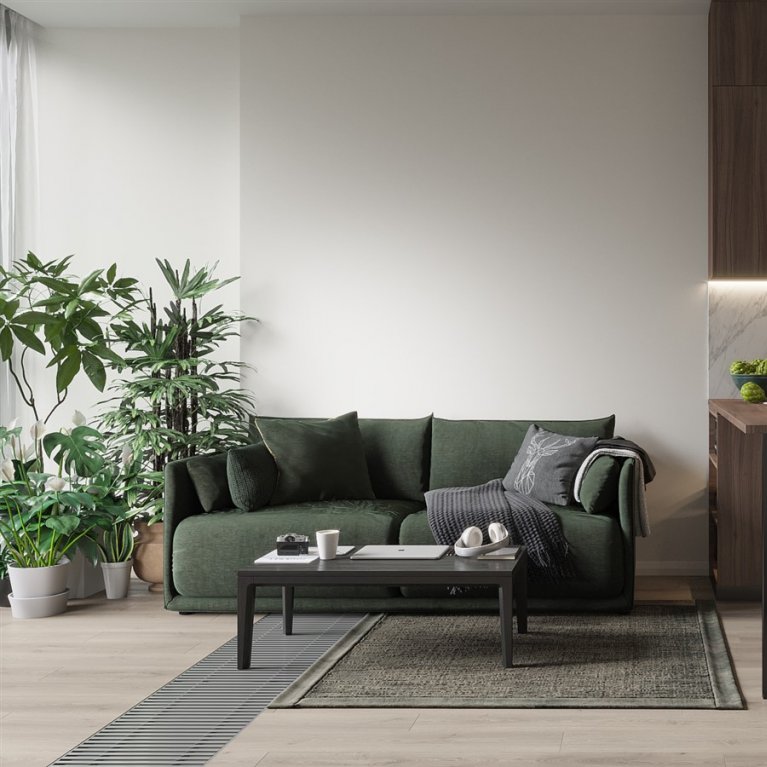
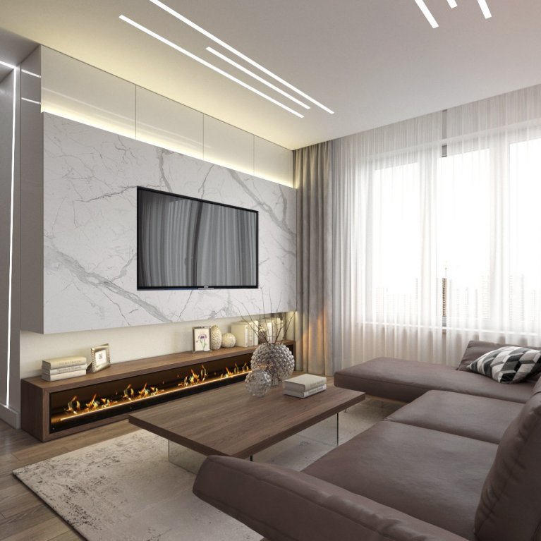
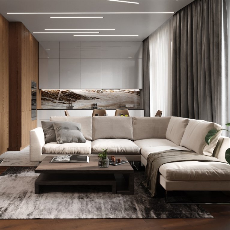
Hello everybody! If you are planning to do repairs or you are doing it now, necessarily this information can help you learn 18 ways how to make your interior visually more expensive.
1. The walls
When you enter the apartment, the first thing you pay attention is the air. Not what it smells like here, it is about air volume. The walls, or rather their absence, contribute to the amount of air. When you are buying an apartment or making its replanning, make sure that there are as few walls as possible and only where they are needed. Nothing makes the interior so much cheaper than small hallways and narrow corridors.
2. The floor
The second thing, when we enter the apartment, we pay attention to the floor. Visually the larger floor gives us the feeling of more space and air. In order for the floor to be as large as possible, make sure that the maximum amount that hit your eye is made of one material.
Many people are in the mistaken belief that the whole design will be more interesting if you make the floor from different materials. Or even with some kind of intricate crossing. As a result, it looks tasteless and cheap.
3. The ceilings
Leave behind the crazy ideas associated with split-level ceilings, backlights and puck lights. If possible, make the ceiling flat, without any special tricks. All these attempts to make a "designer ceiling" will cost you a pretty penny, but it will look like a redevelopment from the 2000s. Plasterboard structures are appropriate only where technical need dictates, for example it can be ventilation routes, various communications, structural features of the building, etc.
4. The style
You should choose the right style for your apartment. Attempts to create a Victorian era in modern housing with modern design standards, low ceilings and standard windows make you decision unsuccessful. Do you like the stucco works and Renaissance? Just go to the Hermitage and don't torture yourself or your designer. In a decade, I have never seen a more successful example of arranging such an apartment.
5. Decoration of the walls
I`ve got an idea that textured and patterned wallpapers can be nice and appropriate, especially in standard modern apartments, only if they are painted. The more self and without a design furnish are chosen, the more expensive and stylish your interior will be at first glance.
6. The blinds
In order for the interior to look more expensive, it is very important to correctly take shape the window. Vertical or horizontal office fins, curtains in "expensive" style, all this makes the interior cheaper. The blinds should be made of good fabric, ironed and hang to the full height of the walls. Ideally, when the curtains fall from under the ceiling and even overlay to the floor. It`s allowed even when the blinds lie on the floor.
7. The windows
By and large, in our apartments, the windows are white and plastic. But if you want that the interior to look more expensive in the end, ideally change them to black or dark gray. If you have enough money, or course, in other circumstances you can repaint them. There is a special paint for PVC windows. Black frames will immediately make the interior look more expensive than it really is. The renovation will look more stylish and modern.
8. The window jambs.
The best way is to make the window jambs plaster or drywall. In no case do PVC slopes. Yes, this is the fastest, easiest and cheapest way, but it also dingy-looking afterwards. Especially if you consider that due to the design features of the sandwich panels from which these PVC slopes are made, it will be necessary to somehow close the hairline joint between the wall and the slope. And most likely it will be a corner with a plastic, that`s why the conclusion becomes obvious.
9. The window sills
In no case don't make a PVC window sills with overhangs and horizontal outreaches on the sides. Such a window sill will visually make the cheaper view. If you really want to make the interior look more expensive, make window sills of artificial stone and large-format porcelain stoneware, without overhangs and horizontal outreaches.
10. The shelves must be closed.
The fewer things in sight, the more commodious the room looks. Choose furniture with closed shelves as possible. The less we saved the clutter, and all our figurines, assorted books, magazines etc., the more expensive and stylish the interior will be.
11. Large art.
Pictures can make the decoration richer, just don't hang reproductions of classic landscapes on the wall. Such a technique would rather say not about your taste, but about the fact that it doesn't exist. Instead, pick up paintings in a modern style, which depicts something incomprehensible, the main thing is that such pictures doesn't stand out from the general color scheme of the interior.
12. The tiles
Use plain large porcelain stoneware for your bathroom. Large format tiles look expensive. Also, try not to use two different types of porcelain stoneware in the same room. It will look like a young inexperienced designer did the interior. Instead, use bathroom furniture to add lumpiness to the materials. For example, the walls can be finished like stone, and furniture like wood, here you have two different materials in the bathroom. It looks more expensive than trying to combine stone and wood for wall decoration.
13. The floor boarders.
Use a concealed installation or shadow profile instead of the usual PVC and PU floor boarders. The shadow profile makes the interior more modern and stylish, the walls have a floating effect and, in general, the solution will look technological, and as you know technologies are expensive. If in your design dreams you need the board to match the color of the floor, for example wood-like, then choose a flush-mounted. If in the color of the wall, then choose the shadow profile.
14. The dadoes
Use dadoes for wall decoration if you don't have a lot of money. You can use tinted plywood, if you choose it correctly, cut it and mount it, and the effect will be simply amazing. You can also use chipboard, the only thing that you need to remember to make an edge on the cut ends, but the most interesting option would be to use veneered MDF panels, although this option is the most expensive.
15. The lighting
Did you know that when designing lighting for the most expensive hotels and restaurants, a technique is used, in which aerobatics is considered when you cannot see the light sources. So, few people think about it, especially now. Try to get rid of spotlights that are evenly spaced across into the ceiling. Instead, arrange the light by level: top, middle, bottom. It creates an atmosphere, and nothing makes an interior as expensive as the right atmosphere. You can spend a lot of money on furniture and furnishings and ruin everything with boring light. The more lighting devices you have, the more expensive the interior will look.
16. The doors.
The doors are different, it all depends on the design and on your wallet. There are no cheap beautiful doors, so if the budget is small and you want it to be stylish, put Finnish doors. Just ask your supplier to replace the standard handles. With the right choice, the combination will be winning. Always choose the highest doors (required).
17. The furniture mountings.
Pay particular attention to profiles and handles. Almost all budget furniture is equipped with cheap Chinese handles. If you make custom-made furniture, then use the profile and milled handles. You can also find more interesting handle options from specialized manufacturers, buy them separately and install. Competently selected fittings will make the furniture visually more expensive, and this will work for the entire interior benefit.
18. The interior color scheme.
With a fairly small investment, you can achieve very impressive results. The main thing is to choose the right color. It`s enough to open a fashionable glossy magazine on interiors or the page of the top designers in Instagram, you will see that all fashionable interiors are made in restrained colors. Basically, the schemes are based on natural color combinations. Bright juicy colors look bold, extravagant but not stylish and sophisticated.
That's all. Send it to your friends who are making repairing work. Share with them. I hope this will save you and them from unpretty designs.


